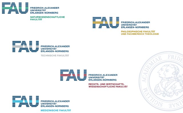
New logo of my university, hmmm...
This one is the new logo, never get informed about logo changing...
Below is the logo of a famous company:
But I like these color-based VIs for each faculty.
And I prefer the old logo which is shown in the background, looks much more "academic".
good....
wow
原来以为是学生设计的,没想到居然花了很多很多钱,这个就太过分了!
Info 的论坛上当天就已经出现大量搞笑衍生版本了 :)
看到fu两个字母我就会总往那个单词上想,要不得啊要不得,哈哈。